Colour matching for print probably doesn’t sound that complicated. Or is it? You’ve designed yourself a nice brochure, slapped your logo on it and a couple of photos and sent it off to the printer. You spent ages choosing the right shade of millennial pink. Then you get your precious prints back and that pink is now more Barbie™ than pastel.
What happened?
COLOURS CAN VARY FROM SCREEN TO PRINT (AND VICE VERSA)
Viewing colours on your screen will usually look quite different in person. The colours on screen are produced by red, blue, and green light – RGB. In RBG, combining all the colours makes them brighter. In CMYK, as used in print, the colours are cyan, magenta, yellow, and black – and combining the colours makes them darker!
There is also the fact that unless you’re a professional graphic designer or similar, you might not be using the kind of high quality monitor suited for working with colour reproduction, or it hasn’t been calibrated.
Then there’s the fact that humans can perceive colours differently to each other. Remember “the dress“?
COLOUR MATCHING FOR PRINT
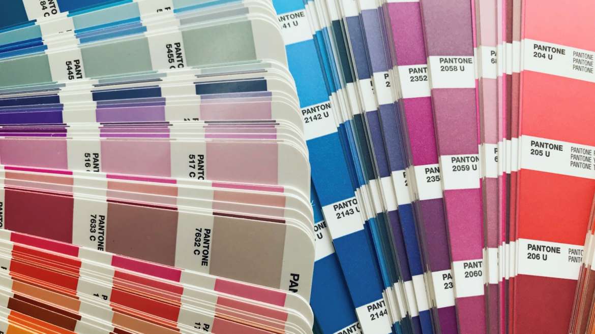
You may have heard of the “Pantone Matching System” – this is a global standard of colours developed in the 60’s, widely used across the design industry – including for print. It covers colours in all shades with “recipes” to create each colour, along with special ones such as metallic, pastel, and fluorescent.
If your printer does Pantone work, also known as spot colours, you can tell them that you would like to use PMS 2096 C, and they will know what you want.
Making that happen actually can depend on a few different factors. Firstly, if you specify PMS 2096 C – you’re specifying the coated colour – that is, to be printed on a coated stock.
While coated and uncoated colours have the same mix of ink, the final result can vary due to a number of factors. It’s important to remember that if you have chosen PMS 2096 C, but the stock you’re using is uncoated, you’ll actually be getting PMS 2096 U – the uncoated colour.
COLOUR MATCHING FOR PRINT – COATED VS UNCOATED COLOURS
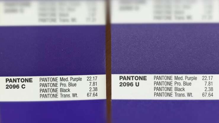
Pantone 2096 is made up of the following:
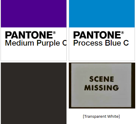
- 22.17 parts Pantone Medium Purple
- 7.81 parts Pantone Process Blue
- 2.38 parts Pantone Black
- 67.64 parts Pantone Transparent White
Together, the colours above create the colour below – PMS 2096, AKA Pantone Ultra Violet (the print version), AKA Pantone’s Colour of the Year 2018.
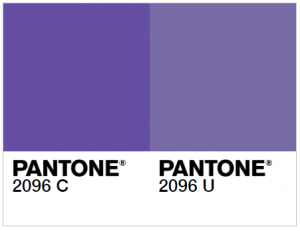
Above is a visual guide from the Pantone website, where you can also find a corresponding hex code or RGB colour profile. Remember that it doesn’t look exactly like this in real life, ok friends?
No matter what it’s printed on, the recipe is the same. A bit like how Coke out of a plastic bottle tastes different to out of a glass bottle, the surface that is printed on will affect the final result.
What causes the difference? One of the main reasons is that when printing on a coated stock, the ink will not absorb into the paper as much as it will on an uncoated stock. This usually results in a lighter colour on the uncoated stock, and depending on the surface of the paper, it can also look more “dirty” due to the fibres of the paper being more visible, such as in some recycled paper stocks.
COLOUR MATCHING FOR PRINT FROM PANTONE TO CMYK
What if you don’t want to, or cannot, use the Pantone colour? For example, printing an image that contains full colour photos along with your company logo, or printing small quantities digitally.
Then you can use the CMYK “breakdown” – the percentages of cyan, magenta, yellow, and black, that most closely resemble that colour. However, while the recipe for an uncoated and coated Pantone colour will be the same, their CMYK values might be quite different.
For example, according to the Pantone website, the CMYK breakdown for old mate Ultra Violet should be the following:
- Coated: 76% of Cyan 75% of Magenta 0 Yellow and 0 Black.
- Uncoated: 66% of Cyan 66% of Magenta 0 Yellow and 0 Black.
Various sources will also provide different CMYK values for the same colour. There is a pretty good resource on the Pantone website for converting between CMYK, RBG, hex codes and more, and Adobe creative suite also has swatches of the Pantone colour books.
While colours in CMYK are made up of dots, a Pantone colour can be 100% of that colour, so the dots are not visible. This can mean a much more solid print.
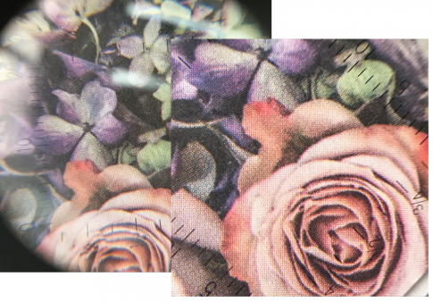
A CMYK print viewed under a loupe
MATCHING YOUR PRINTED SAMPLE
If you’re not sure what you need, but you have a sample of it, just give this to us and in most cases we can recreate it! But remember, we need to see it IRL. A photo, scan, or something sent over email cannot truly represent the colour like seeing it in person.
If you have questions, or need advice on an upcoming print project, just get in touch!